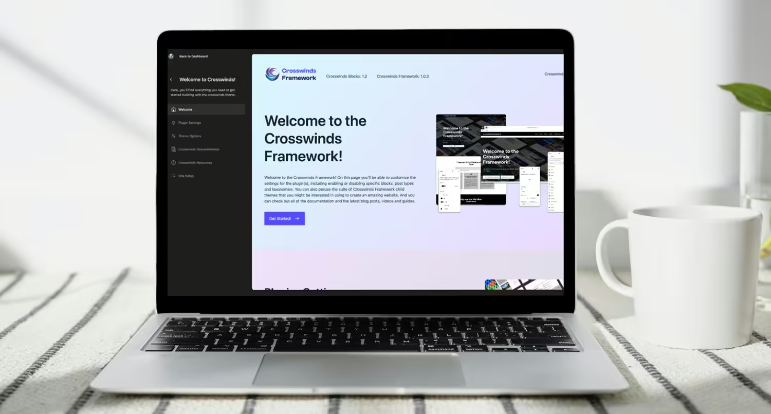
The start of May brought the version 1.2 release of the Crosswinds Blocks plugin and with it came a new settings screen.
This settings screen was built entirely in React, and it emulates the site editor design and the new admin experience that will be coming in WordPress at some point in the future.
It was a real challenge to create this settings screen, as I was taking a complete dive into the world of React outside the context of WordPress block development. And there were certainly moments of frustration.
But the end result is something that I’m quite proud of. It looks great and, I think, is a better user experience for people using the Crosswinds Framework.
So let’s dive in to take a look at how I built the new settings screen for the Crosswinds Framework and what I learned in the process.
The Previous Crosswinds Framework Settings Screen
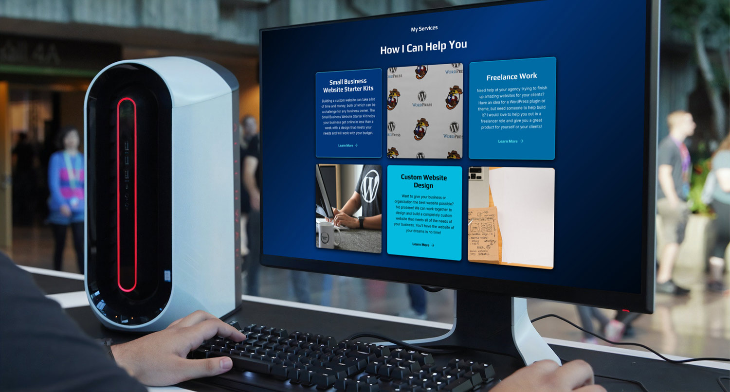
The first iteration on the Crosswinds Framework settings screen wasn’t exactly bad.
I took a lot of inspiration from what Astra did for their settings screen with the version numbers across the top and the settings below.
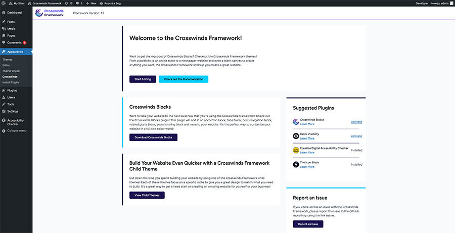
While it was all one page, there were separate sections for plugin and theme settings as well as a column where users could install and activate any suggested or required plugins for the theme they were using as well as callouts for leaving a review, reporting an issue, going to their account page, etc.
Overall it was pretty simple and it was built with traditional PHP, and it was close to something that users were probably already familiar with when interacting with WordPress.
But as I continued building the Framework and the Crosswinds Blocks plugin, I knew that I wanted something more dynamic that would be able to help out users.
Why Make the Switch to a New One
So why did I take the time to not only create a new settings screen for the Framework but also really dive in to learn how React worked outside of the context of WordPress blocks?
Well for starters, I love a good challenge. Heck, that’s how I got started learning web development. I wanted to create a custom design for my WordPress website at the time and wanted to take the time to actually learn HTML, CSS, PHP, JavaScript and MySQL. So in a way, this was a return to my roots as a web developer.
But as I mentioned before, I wanted a settings screen that was more dynamic. I didn’t just want it to be a static page where someone goes to change a few settings. Instead, I wanted it to be a place where a user could go to learn more about how to create their website.
I wanted to be able to create a dynamic documentation section that loads all of the documentation for the Crosswinds Framework products they’re using so they don’t have to go far to understand how something works. And I wanted to be able to pull in the latest blog posts, videos and guides.
While that probably could be done with PHP, using the dynamic nature of React seemed like a better option even if it was a language I would need to learn.
Plus, with the new WordPress admin experience coming sometime in the future, it seemed like a good time to get ahead of the curve for once.
What I Wanted in the New Crosswinds Framework Settings Screen
So now that the decision was made to change the settings screen, it was time to decide what needed to be in the new settings screen. While I had a lot of thoughts, this is what I settled on for the first version of the screen.
Wanted to Keep a Similar Feel
One of the biggest things I wanted to do with the new settings screen was to make it feel similar to the old settings screen even as it was crafted to be similar to the upcoming WordPress admin experience.
I thought the overall layout of the old settings screen was pretty user friendly, especially when it came to the settings and the ability to install and activate required and suggested plugins.
So when I was designing and developing the new settings screen, I focused on keeping as much of the overall styling and feel from the old screen as possible within the new overall look.
Make it a Hub for Resources
Functionality-wise, I really wanted to upgrade the settings screen in a big way.
While the old screen had links to documentation and to places like the blog and videos and guides, it always took the user off of their website and away from where they were building their website.
With this new screen, I wanted to keep as much of that information as possible on their website so that they wouldn’t have to leave their website to learn how to do various things when crafting their website.
In short, the settings screen needed to be a hub for the various resources a user might need to create their website with the Crosswinds Framework.
Make Sure That It’s Still Extendable
Finally, I wanted to make sure that the settings were extendable by other plugins and the themes themselves, including various add-on plugins and child themes that are in the works.
With the old settings screen, this was pretty easy to do with simple PHP. But the move to using React required a lot of planning to first get the various settings through filters and then display those settings on the page. But it was extremely important that this happened instead of hard coding settings.
If I couldn’t find a way to do this, it would not have been worth moving to the new settings screen.
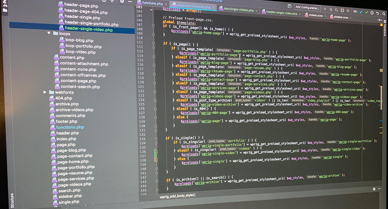
How I Built the New Settings Screen
So with those things in mind, it was time to create the new settings screen for the Crosswinds Framework. It took several weeks to complete, but here’s how I was able to build this new settings screen.
Taking Inspiration from Ollie
So there’s no doubt that Mike McAlister and Patrick Postner did a great job with the Ollie Dash plugin for onboarding the Ollie WordPress theme. And set the standard for theme onboarding in WordPress.
My favorite part about it is how similar it looks to the site editor as well as the upcoming new WordPress admin interface, so I took a lot of inspiration from how they went about building their settings screen/onboarding wizard.
It also was a great tool for learning how to use React outside the context of WordPress blocks.
For the most part, I’m pretty comfortable with using React to build custom blocks. But outside of that, I can get overwhelmed quickly. But being able to look through the code to really understand what was going on and how it all worked was a big help in really learning how to develop with React.
So a special shout out to Mike and Patrick for their amazing work with Ollie!
Setting Up the Context
The hardest thing for me to wrap my head around conceptually was context.
In fact, before I started taking a look at how the Ollie Dash plugin was built, I had no idea what context even was, let alone how it works.
But after taking some time to really learn how it works, especially through the Ollie Dash plugin, I was able to figure out a strategy for the settings screen.
First, I would need to create REST API routes for different aspects of the settings, including blocks, post types, taxonomies and other settings. And there would be routes for theme settings to hook into. The routes would get the settings (as well as applying filters to add on plugins can also add their own settings) and save the settings.
So with that all mapped out, it was time to create the screen.
Creating the Main Page
I wanted the main landing page of the settings screen to be a place that could point the user in the right direction depending on what they wanted. So there are basically links to each of the pages within the settings screen along with links to external resources.
But the biggest benefit for me for this page was being able to slowly ramp up my React development.
It was a simple enough screen that I could really play with how components and pages work as well as fine tune the styling I wanted throughout the rest of the settings screen.
Once that page was finished, it was time to move onto the harder pages.
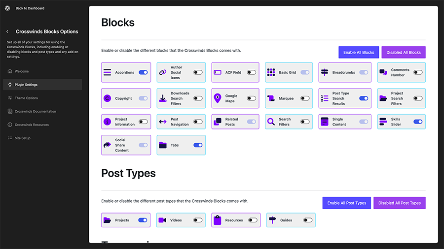
Creating the Plugin Settings Page
The hardest page, by far, was the plugin settings page. There’s just a lot that goes on in this page.
There are sections for block settings, post type settings, taxonomy settings and other settings.
The real trick here was not hard coding any of these settings. I wanted to make this as dynamic as possible so that adding in new settings later would be as simple as adding some PHP and that any add-on plugins or third-party plugins would be able to add their own settings to the screen.
Another complicating factor was trying to figure out how to make that all work with the context stuff and saving it. While the PHP end was pretty simple — just get the data and save it to the right spot — how to get it from the fields in JS to the REST API and PHP was a challenge.
I first started off by creating components for various field types so that it would be easy to repeat those based on what settings declared as a field type in the PHP. And then those were loaded into different field areas (block, post type, general, etc.). Seems simple enough.
But the challenge was handling state change for those fields. Fortunately, using context helped a ton in this area. But handling the enable/disable all features for blocks, post types and taxonomies didn’t work because, again, context.
I ended figuring that one out by having the onClick function for those buttons go through each block in the array and changing the value that way. But that was only after about a million different attempts at a solution. I’m glad I stuck with it, but it was definitely a chore to complete.
But once I had the plugins settings page figured out, it was all downhill from there to finish the rest of the settings screen.
Creating the Theme Settings Page
By comparison, the theme settings page was a bit easier.
Now that I had solved the problem with the plugin settings, all I needed to do was duplicate that work for the theme settings.
But there were two additional items that needed to be added to the theme settings.
First, I needed to add in theme activation as a settings option for a premium theme. So for that, I brought in the plugin/theme updater code from the Easy Digital Downloads Software Update add on to the plugin. I then created a new REST API endpoint to handle the PHP side of activating a theme license. And finally I created the component to display it all in the settings screen. Simple enough.
The bigger challenge was the plugin installation and activation of required and suggested plugins. For this, I was able to use Merlin WP by Rich Tabor to figure out how to use PHP and the TGMPA plugin to handle the installation and activation for me. It took a little bit of work, but I eventually got it to work.
And finally, if the user was just using the Crosswinds Blocks plugin, I wanted to display a list of Crosswinds Framework themes as a subtle marketing bit to hopefully get them to look at what the Framework can really do.
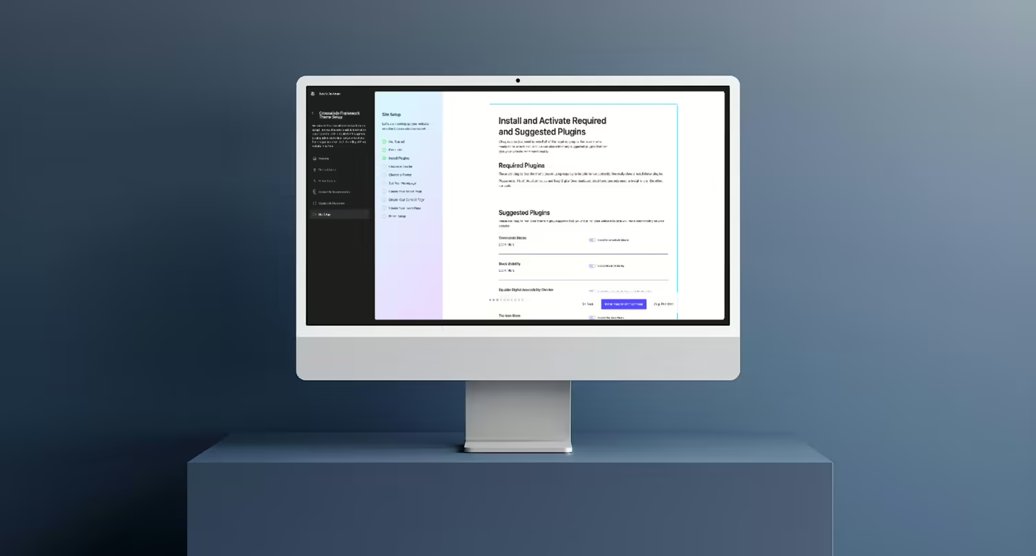
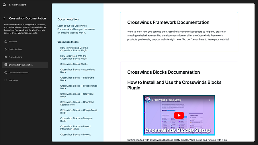
Creating the Documentation Page
Now for the documentation page, I could have just hard coded all of the documentation into this page. But, as we all know, documentation is fluid and can change a lot. Plus, this documentation would need to contain docs for the plugin, base theme and all child themes and be displayed based on what the site user has active.
So this documentation would really need to be dynamic. And thankfully with the REST API, it was pretty easy.
I was able to pull in the documentation from the Crosswinds Framework docs website based on a products taxonomy and then display that content based on which Framework products a site user has on their website.
I was then able to make that work with a similar layout from the Ollie Dash documentation page to make for a seamless and easy-to-navigate documentation page for the settings screen.
And the best part is that the documentation will be updated for the site user without them having to do anything. And they don’t have to leave their website to view the documentation. A win for everyone.
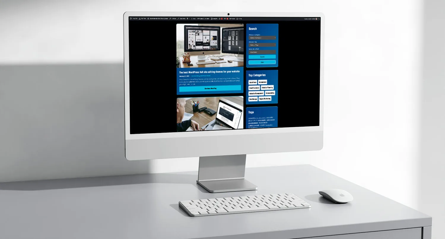
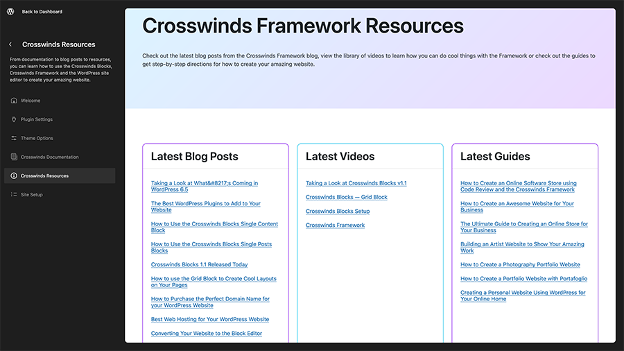
Creating the Resources Page
Finally, the last page to create was the resources page.
This easily could have just been a static list of links for a user to click, but I wanted something more to this screen.
Instead, I wanted to display the latest blog posts from crosswindsframework.com, the latest videos from the YouTube channel and the latest guides from the website.
The blog posts and guides were the easiest parts to create since it was still using the WordPress REST API, just from an external angle.
The videos were more of a challenge since YouTube’s API is a bit confusing. It’s not quite as straightforward and there are hoops to jump through.
But I was able to make it work and to wrap up the new settings screen with a dynamic resources page that can help users learn more about how to create a cool website with the Crosswinds Framework.
What I Learned From Creating the Crosswinds Framework Settings Screen
So it turns out that when you take a month-long dive into learning how to use React outside of WordPress blocks and create your own settings screen, you end up learning a lot (along with a lot of frustration and success). Here are some of the top things I learned while creating the new settings screen.
React Can Be a Fun Language to Build With (But it is Frustrating)
So yeah, React is definitely a language that can be very frustrating to build with, especially when you’re first learning how it works.
It’s not quite as intuitive as PHP or vanilla JS, and sometimes the errors it spits out make absolutely no sense. I totally understand when developers vent their frustrations about it online and essentially give up.
That being said, when you do figure it out, it can lead to an amazing feeling.
It’s really cool what you’re able to build and do with React apps. And that feeling when everything comes together and works like a charm helps you completely forget about all of the frustration it took to get to this point.
It’s just one of those things that you really have to stick to if you really want to learn React and build projects with it.
A Little Organization Can Go a Long Way
Another thing that I learned is that React projects can get pretty big pretty fast when it comes to the number of files created. Every page, component, and anything in between essentially needs to be its own file.
So organizing those files in a way that makes sense is pretty crucial.
I am glad that I was using the Ollie Dash plugin as a guide since Mike and Patrick did a great job in organizing the React files in an easy-to-understand way, otherwise things might have gotten out of hand on my end when creating the settings screen.
So now when I’m creating a React project, one of the first steps is going to be to figure out the directory structure and organization before actually writing any code.
Rekindled a Love for Building Things Again
Finally, creating the settings screen really rekindled that love of building and creating things that got me into web development in the first place.
One of the things that hooked me into web development over ten years ago was the fact that I could write some code and a design would appear on the screen. That was really cool for someone who had the drawing skills of a potato.
Unfortunately as time has gone on, that sense of wonder has kind of faded away. A lot of what I do at my full time job isn’t that, and problems plaguing WordPress have also contributed to that love lost.
But creating this setting screen brought me right back to that love of learning something new and creating something cool.
Was it a lot of hard work? Yes. Were there a lot of moments of frustration? Yes.
But the end result is something that I have a lot of pride in, and I’m proud of the fact that I stuck through it all and built it.
Now hopefully I can take this momentum and build more cool things.
What Might Be Next for the Settings Screen
So now that the settings screen has been built, what’s coming down the pipe for the screen in future releases?
For starters, I want to make it actually responsive. I’m sure that a majority of people are going to be using the settings screen on their desktop devices, but I know there are people who just want to use their phone to create their website. So I need to make sure that it’s responsive and easy to use on mobile devices.
Also, while I’m pretty sure that the options can be extended by other plugins and themes, I’m really going to be testing that out with a couple of add-on plugins I’m working on for other child themes for the Framework. So I’ll be fixing any issues that might arise there.
Finally, I’m sure I’ll find something along the way that can be improved. I’ll probably work on making the resources page something that helps a user create their specific website type (like creating a site creation checklist based on website type) or something like that.
But otherwise I’m really happy with how the settings screen turned out. I think it’s a great thing for users, and I learned a ton about how to work with React.