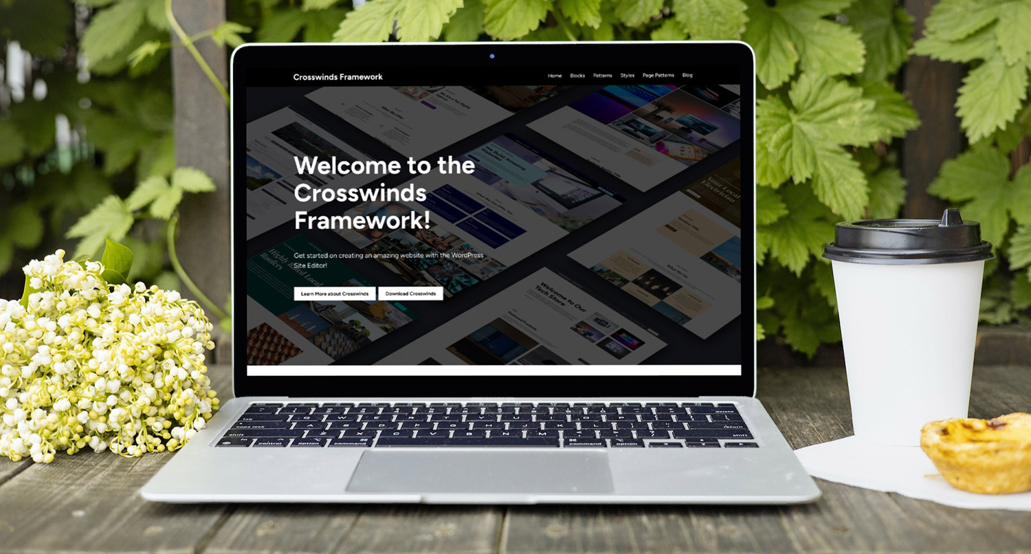
One of the features of the Crosswinds Framework base theme is better responsiveness for the columns block in WordPress core.
It’s a problem that I’ve had with that block for quite a while now, and I’m really disappointed that it hasn’t been fixed in core and that I had to roll my own fix for it.
Surprisingly, it took a while to get the fix just right. I ran through a lot of trial and error with a number of different solutions (including letting the user try to set their own breakpoints) before finding just the right combination of CSS to get the columns to look presentable as the screen size shrinks.
So, if you’re looking for a solution to the columns block for your theme or website, here’s what I came up with and how I got there.
(You can also click this link to get right to the solution I found.)
The Problem with Columns in WordPress Core
All of this started from a problem I had with WordPress core, specifically the responsiveness of a few blocks.
For example, if you use the grid variation of the post template block, there is not a tablet breakpoint in the CSS that takes the number of columns per row down to a number that makes sense for that screen size. So a six column grid will stay six columns until it gets to the mobile screen size.
And it’s roughly the same for the columns block. Even if you have six columns, there is no point where they drop to three columns and two rows. It just goes from six to one at a mobile screen size. So you end up with a really awkward looking section if you’re looking at the block on a tablet.
That’s not an ideal situation, and it’s something I wanted the Crosswinds Framework to fix so that users had a website that looked good at all screen sizes.
My Initial Idea for the Solution
It took a while to get to the right fix for this issue.
Really, the first thing I wanted to do was add an option in the Crosswinds Blocks plugin that allowed users to define their own tablet and mobile screen sizes. But I quickly realized CSS variables have a definite limit, and that solution would be way past that limit and not worth the effort (though it is something that would be nice to have in core).
The next thought was to add in an extra option to the columns block (using the Crosswinds Blocks plugins) that would define how many columns across the block would have at a tablet and even mobile screen size.
But again, I didn’t think that solution would work and that it wasn’t worth wasting the time pursuing.
So it was back to the drawing board.
The Eventual Solution
The solution that made it to the final version of the Crosswinds Framework used simple CSS to take the columns to make sure that they looked
I came across a post by David Bushell that did a lot of the heavy lifting for the CSS, and I’m really thankful for that. It even accounted for columns structures like 67/33 and 25/50/25, which I hadn’t even thought about at the time.
You can see the CSS used in the Crosswinds Framework in the repository linked to below.
So that got added to the minimal CSS needed for the rest of the theme, and is helping to make websites using the Crosswinds Framework have good looking columns block no matter the screen size.
Case closed.
What I Hope to See in WordPress Core in the Future
All of this being said, I do really hope that more responsiveness is added into WordPress core for blocks like the columns block and the eventual grid variation of the grid block.
The burden of fixing responsiveness should not be on the shoulders of theme developers and web developers building sites for clients. It should just happen with the content management system itself.
Also, I would love to see developers be able to define breakpoints or add their own via the theme.json file. It seems like the perfect place to do so and gives developers more options without having to come up with their own solutions. I see that there are quite a few open issues in the Gutenberg GitHub repository that mention something like that.
So hopefully at some point in the future, the fix I applied for the Crosswinds Framework will no longer be necessary.
Check Out the Crosswinds Framework Repository to Learn More
And finally, if you want to take a look to see what I came up with as the solution for the Crosswinds Framework (or if you want to take a look at how to create a block theme), you can check out the GitLab repository for the Framework!